

What color of Solid Color Wallpaper is more suitable for human eyes?
2024-06-07
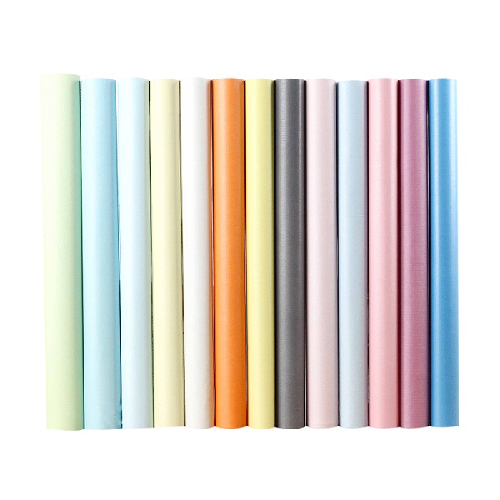
When choosing Solid Color Wallpaper, in order to better protect the eyes, we can consider the following color options:
1. Soft middle tones: such as light blue, light green, etc., these colors can provide a comfortable visual experience and reduce eye pressure. Too bright colors may irritate the eyes, while too dark colors require greater effort from the eyes to identify.
2. Green tones: Green is considered one of the most eye-protecting colors because it is close to natural tones and helps the eyes relax and rest. At the same time, seeing green wallpaper can help relieve eye fatigue and reduce mental stress.
Avoid colors that are too bright or dazzling: such as bright red, bright yellow, etc. These colors may make the eyes uncomfortable and increase the risk of eye fatigue.
In summary, for the choice of Solid Color Wallpaper, it is recommended to give priority to soft middle tones and green tones to better protect eye health. At the same time, according to personal preferences and the overall tone of the room, you can choose the solid color wallpaper that suits you best.
Previous:Advantages of wallpaper(2)